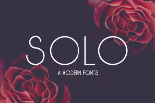
Solo Font: Timeless Lightness with Romantic Sophistication
Solo is a carefully crafted serif typeface that balances minimalism and warmth in a way few contemporary fonts achieve. It’s not merely “light” in weight—it’s light in spirit, with open counters, generous spacing, and delicate stroke modulation that invites readability without sacrificing character. Designed for clarity at small sizes and presence at large ones, Solo works where many elegant fonts falter: in body text, editorial layouts, branding systems, and digital interfaces alike.
What Sets Solo Apart from Other Light Serifs
Many light-weight serifs lean too far into austerity—thin strokes, tight spacing, or rigid geometry that feels clinical rather than inviting. Solo avoids this by introducing subtle organic inflections: gently flared serifs, softened terminals, and a slight upward tilt to the baseline rhythm that evokes handwritten refinement without compromising typographic discipline. Its x-height is thoughtfully proportioned—not oversized like many web-optimized fonts, nor cramped like traditional high-contrast classics—making it legible on screen and in print without visual strain.
The “romantic twist” isn’t decorative flourish for its own sake. It’s evident in the lowercase a and g, which use single-story forms with soft curves; in the gentle swell of the lowercase e; and in the tapered, almost calligraphic entry and exit strokes of letters like f and l. These details don’t dominate—they support. They give Solo quiet personality, especially when set in longer passages or paired with neutral sans-serifs for contrast.
Performance Across Mediums and Sizes
In real-world use, Solo holds up well across environments. At 14–16px on desktop, it maintains clarity without requiring excessive letter-spacing or line-height adjustments. On mobile, its generous apertures and moderate contrast prevent characters from blurring or merging—particularly helpful for blogs, newsletters, or product descriptions where readers scroll quickly and decide within seconds whether to stay.
In print, Solo shines in premium contexts: wedding stationery, boutique packaging, literary magazines, and annual reports where tone matters as much as information. Its regular weight reads comfortably at 10pt in multi-column layouts; its italic offers true cursive flow—not just slanted roman—making it viable for pull quotes, captions, or subtle emphasis without disrupting harmony.
It’s also well-hinted and includes robust OpenType features: discretionary ligatures (subtle but effective in headings), small caps, old-style figures, and localized glyph variants for European languages. These aren’t gimmicks—they’re tools that improve typographic texture and professionalism when used intentionally.
Who Benefits Most—and When
Solo suits professionals who prioritize tone and cohesion over trend-chasing. Consider these practical applications:
- Branding designers building identity systems for lifestyle brands, wellness studios, or independent publishers—where warmth and credibility must coexist.
- Bloggers and content creators publishing long-form essays, personal narratives, or cultural commentary—Solo supports sustained reading while reinforcing voice.
- Educators and course designers developing learning materials that balance approachability and authority—its clarity reduces cognitive load without infantilizing content.
- Small business owners designing menus, service brochures, or email campaigns—Solo conveys care and attention without demanding design expertise to deploy effectively.
It’s less ideal for dense technical documentation, data-heavy dashboards, or UI elements requiring extreme functional neutrality (e.g., error messages, form labels). In those cases, its romantic qualities can unintentionally soften urgency or precision. Likewise, its lightness means it shouldn’t be used at very small sizes (<12px) in low-resolution environments without testing.
Pairing and Practical Integration
Solo pairs naturally with restrained sans-serifs—think Inter, Manrope, or Clash Grotesk—where contrast in structure highlights both fonts’ strengths. Avoid pairing it with overly geometric or monoline sans-serifs (e.g., Helvetica Neue or Montserrat) unless deliberate dissonance is part of the concept; their rigidity can make Solo feel fragile by comparison.
In CSS, Solo performs reliably with modern font loading strategies. It’s available through reputable foundries with proper licensing tiers—including web, desktop, and app usage—so teams can scale usage without compliance risk. For developers, variable font versions (if offered) provide fine-grained control over weight and width, useful for responsive typography systems.
Quality, Consistency, and Long-Term Value
Solo reflects strong typographic fundamentals: even color, consistent stroke contrast, balanced proportions across weights, and thoughtful kerning pairs—not just A–V or T–o, but nuanced combinations like WY, FA, and Th. This consistency pays off in production: fewer manual overrides, fewer last-minute fixes during QA, and smoother handoffs between designers and developers.
Its elegance isn’t tied to a passing aesthetic moment. Unlike fonts built around exaggerated trends—extreme contrast, distorted proportions, or forced irregularity—Solo’s strength lies in restraint. That makes it durable: a brand using Solo today won’t need rebranding in two years because the font “feels dated.” It’s designed to recede gracefully into the background while still contributing meaningfully to perception.
That said, Solo isn’t universally efficient. Its lighter weights require careful hierarchy planning—if every heading uses Solo Bold, visual distinction collapses. And while its italic is expressive, it’s not intended for heavy emphasis; reserve it for stylistic nuance, not semantic stress. Users should treat it as a tonal instrument, not a utility tool.
Realistic Recommendations for Implementation
Start small. Try Solo in a single, high-impact context first: a blog’s body copy, a landing page’s testimonial section, or a product description block. Compare it side-by-side with your current font at identical size, line-height, and measure. Note where it improves flow—or where it demands adjustment.
If you’re working in Figma or Adobe XD, test how Solo renders across device mockups, not just at 100% zoom. Check grayscale and inverted modes if your audience includes users relying on accessibility settings. And always verify licensing: some versions include only Latin glyphs, while extended releases cover Cyrillic, Greek, or Vietnamese—essential for global-facing projects.
For teams managing multiple contributors, document usage guidelines early: recommended weights (e.g., Regular for body, Medium for subheads, Bold sparingly), pairing rules, and spacing defaults. Solo’s subtlety means inconsistency is harder to spot—but just as damaging to perceived quality.
Solo doesn’t solve every typographic challenge, nor does it claim to. What it offers is reliability wrapped in quiet distinction: a font that communicates care through craft, not ornament. It works best when the goal isn’t to shout, but to resonate—clearly, calmly, and with intention.