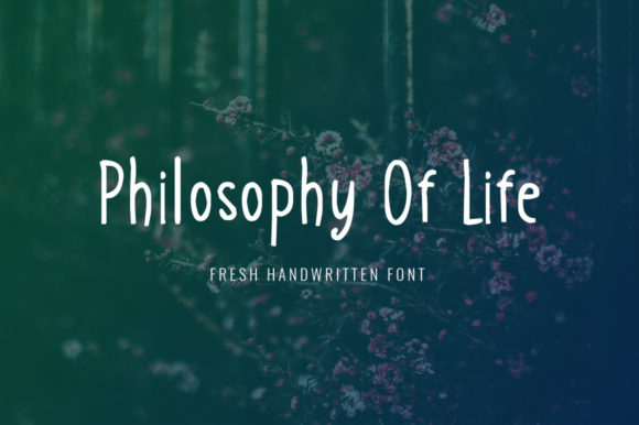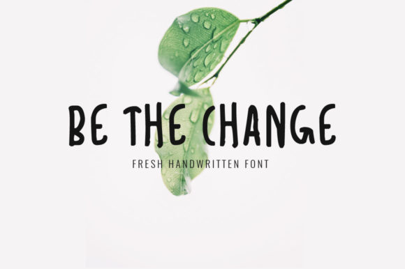
Be the Change Font
Be the Change is a handwritten typeface designed to evoke authenticity, warmth, and approachability. It features irregular stroke widths, subtle variations in letter spacing, and organic imperfections—characteristics that mimic natural pen-on-paper writing. Unlike many script fonts that prioritize flourish over function, Be the Change balances expressiveness with legibility at moderate sizes, making it suitable for short-form applications where personality matters.
Why Designers Consider Be the Change
Designers often seek typefaces that reinforce tone without requiring additional visual elements. Be the Change appeals to those working on projects where sincerity, inclusivity, or grassroots energy are central themes—such as community initiatives, educational materials for younger audiences, wellness branding, or nonprofit campaigns. Its “cute and adorable” quality isn’t merely aesthetic; it signals openness and empathy, which can support messaging around care, growth, or collective action.
Users may also be drawn to Be the Change because it stands apart from more common script fonts like Great Vibes, Dancing Script, or Pacifico. Its uniqueness lies not in ornate swashes but in its restrained, human-scale rhythm—each character feels intentionally placed rather than algorithmically generated.
Practical Benefits and Realistic Tradeoffs
One benefit of Be the Change is its suitability for display use in headings, logos, invitations, and social media graphics. At sizes above 24 pt, its structure remains clear, and its lowercase forms retain distinction—unlike some highly stylized scripts where letters like “a,” “e,” and “o” blur together. The font includes standard Latin characters, numerals, and basic punctuation, supporting English-language projects without requiring extended character sets.
However, Be the Change has limitations worth acknowledging. It is not intended for body text: line spacing, x-height, and inter-character consistency make extended reading difficult. It lacks OpenType features such as stylistic alternates, ligatures, or small caps—so typographic refinement options are minimal. Additionally, while its charm comes from irregularity, that same trait can reduce scanability in fast-paced contexts (e.g., digital banners or mobile notifications), where predictability aids comprehension.
Licensing is another consideration. Be the Change is typically available under desktop and web font licenses, but usage rights vary by vendor. Some versions permit personal use only; commercial deployment—especially across platforms like email clients or embedded apps—requires verification of license scope. Always review terms before integrating into production workflows.
When Be the Change Fits Well
Be the Change works effectively when the goal is to soften hierarchy or add emotional resonance to a limited number of words. Examples include:
- Event titles for school fundraisers, local workshops, or volunteer drives
- Logo lockups for childcare centers, literacy nonprofits, or mental health advocacy groups
- Illustrated book covers or chapter headings aimed at middle-grade readers
- Printed thank-you cards, certificates, or handouts where tactile warmth supports message intent
In these cases, the font’s modest scale and gentle contrast align with design goals centered on accessibility and relatability—not prestige or authority. It complements clean sans-serif body text well, creating contrast without visual competition.
When Alternatives May Be More Appropriate
If your project demands versatility across multiple weights, languages, or responsive environments, Be the Change may fall short. For instance:
- Multi-page reports or long-form websites: A legible, scalable serif or sans-serif family will serve readability better than any script font.
- Brands targeting broad age ranges: While Be the Change reads as friendly to many, older audiences may find its looseness less immediately decipherable than more structured handwriting styles.
- Applications requiring WCAG compliance: Its low contrast and variable stroke width may challenge users with low vision, especially at smaller sizes or against busy backgrounds.
- Projects needing multilingual support: The font does not include extended Latin diacritics (e.g., ě, ñ, ø) or non-Latin scripts, limiting use in global or bilingual contexts.
Alternatives worth evaluating include Quicksand (a rounded, friendly sans-serif with excellent readability), Caveat (an open-source handwriting font with more consistent spacing), or Architects Daughter (a slightly more structured handwritten option with broader language coverage).
Making an Informed Choice
Selecting a typeface involves balancing expressive intent with functional requirements. Before choosing Be the Change, ask:
- What role will the font play? If it’s for headlines or accents only—and those elements appear consistently in accessible sizes—it’s likely appropriate.
- Who is the primary audience? Test samples with representative users. Does the style feel welcoming without sacrificing clarity? Observe first-glance recognition of key words.
- Where will it appear? Print applications tend to accommodate Be the Change more readily than constrained digital interfaces. Check rendering across browsers and devices if using web fonts.
- What’s the production timeline? Because Be the Change offers few built-in typographic tools, adjustments often require manual kerning or layout tweaks—adding time during refinement phases.
Finally, consider pairing strategy. Be the Change pairs best with neutral, highly legible companions—think Inter, Source Sans Pro, or Lora. Avoid combining it with other decorative fonts or high-contrast serifs, which can create visual tension rather than harmony.
In summary, Be the Change is a purpose-built tool—not a universal solution. Its value emerges most clearly when used intentionally, sparingly, and in alignment with communication goals rooted in authenticity and connection. Evaluating it alongside project constraints, audience needs, and technical context helps ensure the choice supports both design integrity and user experience.