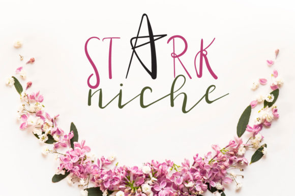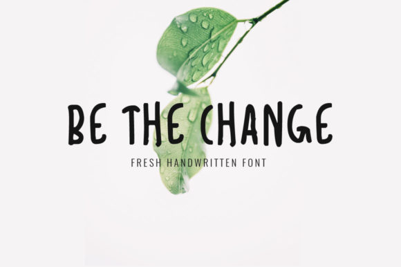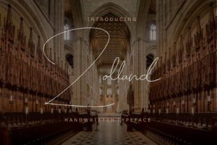
Zolland: The Strategic Choice for Distinctive Visual Communication
Typography is rarely neutral. Every font carries weight—psychological, cultural, and functional. Zolland isn’t just another elegant serif; it’s a precision instrument for designers and communicators who understand that distinction isn’t decorative—it’s operational. Its delicate charm emerges from balanced proportions, subtle contrast, and refined letterforms that command attention without demanding it. That balance makes Zolland especially valuable when clarity, credibility, and quiet confidence matter most.
Why Zolland Fits Real-World Strategy—Not Just Aesthetics
Choosing a typeface isn’t about personal preference alone. It’s a decision with downstream effects on perception, retention, and alignment. Zolland supports strategic goals because it bridges two often-competing priorities: sophistication and approachability. Unlike high-contrast display serifs that can feel distant or overly formal, Zolland maintains warmth through open counters and gentle stroke modulation. That makes it unusually effective in contexts where trust and nuance are non-negotiable—think brand guidelines for professional services, editorial design for thought leadership, or product packaging for premium lifestyle offerings.
For entrepreneurs launching a service-based business, Zolland signals competence without coldness. For educators designing course materials, its legibility at small sizes supports comprehension without sacrificing visual identity. For publishers curating long-form content, its rhythm encourages sustained reading—not just scanning. These aren’t incidental benefits. They’re outcomes of deliberate typographic intention.
When Zolland Delivers Measurable Value
Zolland earns its place most reliably in three overlapping scenarios:
- Brand refinement: When a company has moved past early-stage scrappiness and needs typography that reflects maturity, consistency, and considered judgment—without veering into sterility.
- High-intent communication: Where the reader is already engaged—annual reports, investor decks, white papers, or application interfaces for B2B SaaS—Zolland reinforces seriousness while preserving human tone.
- Cross-platform cohesion: Its strong hinting and well-tuned metrics make Zolland perform predictably across print, web, and mobile—reducing the need for fallbacks or custom adjustments that erode brand integrity.
It’s less suited for environments requiring rapid scannability at scale (e.g., dense e-commerce category pages) or ultra-casual contexts (social-first meme formats, youth-oriented apps). That limitation isn’t a weakness—it’s evidence of focus. Zolland works best when used where impact matters more than speed.
How to Integrate Zolland Thoughtfully—Not Decoratively
Start with purpose—not appearance. Before applying Zolland to a headline or logo, ask: What outcome do we want this element to support? Is it to establish authority? Invite reflection? Signal exclusivity? Clarify hierarchy? If the answer is vague (“it looks nice”), pause. Zolland’s elegance gains meaning only when anchored to intent.
Pair it deliberately. Its restrained character thrives alongside clean, functional sans-serifs—think Inter, IBM Plex Sans, or even modestly weighted versions of Helvetica Neue—for body text or UI labels. Avoid pairing it with fonts that compete for attention (e.g., other high-contrast serifs or ornate scripts), which dilutes its quiet authority.
Respect its scale. Zolland shines at 16pt and above in print, and 20px+ on screen for headings. At smaller sizes, its fine details begin to soften—making it less ideal for captions or footnotes unless carefully tested on target devices. Use optical sizing if available, or choose a dedicated text variant designed for lower resolutions.
Risks of Using Zolland Without Context
Misapplication is the primary risk—not technical failure. Deploying Zolland in a context that contradicts its inherent qualities creates dissonance. Imagine using it for a fast-food delivery app’s call-to-action button: the contrast between urgency and Zolland’s measured pace undermines both usability and brand coherence. Similarly, applying it across every level of a sprawling corporate website—navigation, form fields, error messages—overloads the system and blurs hierarchy.
Another subtle but consequential pitfall is assuming elegance equals universality. Zolland communicates particular values: deliberation, craftsmanship, continuity. If your audience associates those traits with elitism—or if your offering prioritizes disruption over refinement—the mismatch can alienate rather than attract. Always test with real users, not just internal stakeholders.
Practical Planning Tips for Long-Term Use
Build usage rules—not just style guides. Specify not just *where* Zolland appears, but *why* and *what it replaces*. For example:
- Use Zolland only for primary headlines, signature quotes, and official document titles—not subheads, buttons, or data tables.
- Require a minimum line length of 50 characters per line in body copy when Zolland is used for pull quotes, to preserve readability.
- Define exact weights for each use case: Light for minimalist branding applications, Regular for editorial headlines, Medium for printed certificates or awards.
Document fallback behavior. If Zolland fails to load on a critical landing page, what’s the graceful degradation path? Specify a system-stack alternative (e.g., “Georgia, serif”) that preserves x-height and general proportion—rather than defaulting to something visually jarring like Arial.
Zolland as Part of a Broader Communication Discipline
Typography doesn’t exist in isolation. Zolland becomes more powerful when aligned with voice, color, spacing, and interaction patterns. A brand using Zolland for its logo but relying on clipped, staccato microcopy undermines the font’s inherent fluidity. Likewise, pairing it with aggressive animation or chaotic layout negates its grounding effect.
Consider Zolland as one node in a communication ecosystem. Its value multiplies when supported by consistent tone (measured, not florid), thoughtful whitespace (generous, not sparse), and intentional color (muted palettes often complement its subtlety better than high-saturation schemes). That kind of alignment doesn’t happen by accident—it’s the result of cross-functional planning involving designers, writers, developers, and product leads.
Decision-Making Guidance for Teams
If you’re evaluating Zolland for an upcoming project, avoid binary thinking (“yes” or “no”). Instead, assess along three dimensions:
- Alignment: Does Zolland reflect how your audience should feel when engaging with this material—not how you wish they’d feel?
- Consistency: Can you apply it meaningfully across at least three high-impact touchpoints (e.g., homepage hero, email signature, presentation deck) without stretching its capabilities?
- Control: Do you have the technical capacity—and team discipline—to enforce usage rules? Unchecked proliferation weakens impact faster than underuse.
For freelancers and small teams, start narrow: apply Zolland to one deliverable where first impressions carry disproportionate weight—like a pitch deck or client proposal—and measure response qualitatively (comments on tone, perceived professionalism) before scaling.
Long-Term Value Beyond the First Impression
Zolland’s durability lies in its resistance to trend fatigue. Unlike fonts built around momentary stylistic shifts (e.g., exaggerated ink traps, extreme compression), Zolland draws from enduring typographic principles—proportion, rhythm, contrast—that remain legible and resonant across decades. That makes it a sound investment for organizations building assets meant to last: brand systems, educational platforms, archival publications, or product ecosystems.
More importantly, choosing Zolland signals a commitment to intentionality—not just in design, but in communication strategy. It invites teams to slow down, clarify objectives, and align form with function. That discipline compounds over time: clearer messaging, stronger recall, fewer revisions, more confident decisions.
In a landscape saturated with interchangeable visuals, Zolland doesn’t shout. It settles. And sometimes, the most strategic move is to let quality speak—quietly, consistently, and with unmistakable presence.